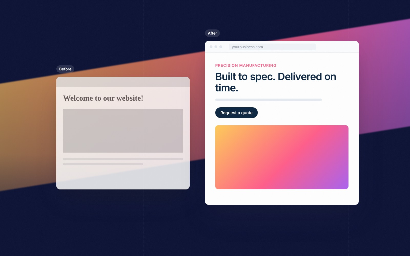
When someone lands on your homepage, they’re asking three quick questions:
If the top of your page doesn’t answer those almost instantly, many visitors leave. Not because your business isn’t right for them, but because they couldn’t tell.
Here’s what belongs above the fold, and what doesn’t.

Your headline isn’t the place for a clever slogan. It’s the place for clarity.
Weak: “Excellence in Every Detail.”
Strong: “Websites and marketing for professional services firms that want more qualified leads.”
A good test: if a stranger read only your headline, could they explain what you sell?
Right below the headline, add one sentence that tells visitors who you help and the outcome they get.
This is where the right visitors think, “That’s me.” It also quietly filters out people who aren’t a fit, which saves everyone time.
Many homepages offer five buttons: learn more, see services, read our story, view work, contact us.
Too many choices create hesitation.
The fix: One primary action, such as “Book a call” or “Get a quote,” and at most one secondary option like “See our work.” Make the primary button visually obvious.
Trust needs to show up early. Near the top of the page, include one quick credibility signal:
Visitors don’t need your full story yet. They need a reason to believe you before they keep reading.
Your hero image or video should reinforce what you say, not decorate the page.
Show your real work, your team, your product, or the result customers get. Generic stock photos of handshakes and skylines say nothing about you.
And keep it light. A heavy video that slows the page down costs more visitors than it impresses.
Above the fold works best when it’s focused. Move these lower on the page:
Clarity first. Detail later.
The top of your homepage doesn’t have to say everything. It has to say enough to keep the right people reading:
Get those right, and the rest of your site finally gets the attention it deserves.